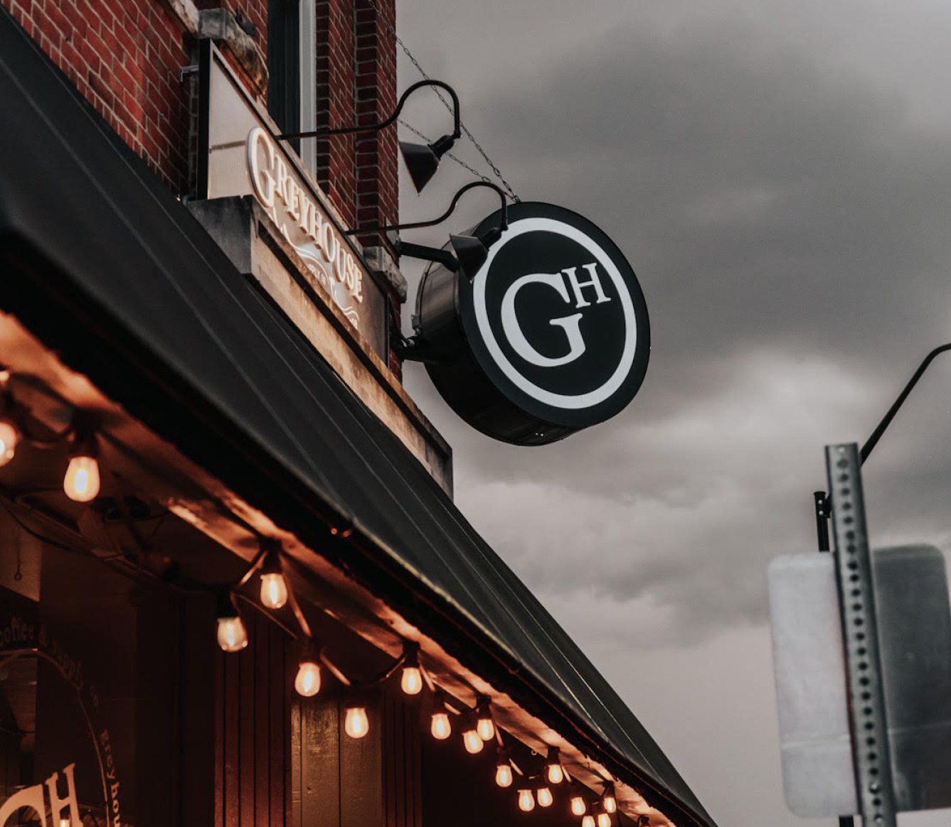
LOGO : GREYHOUSE COFFEE

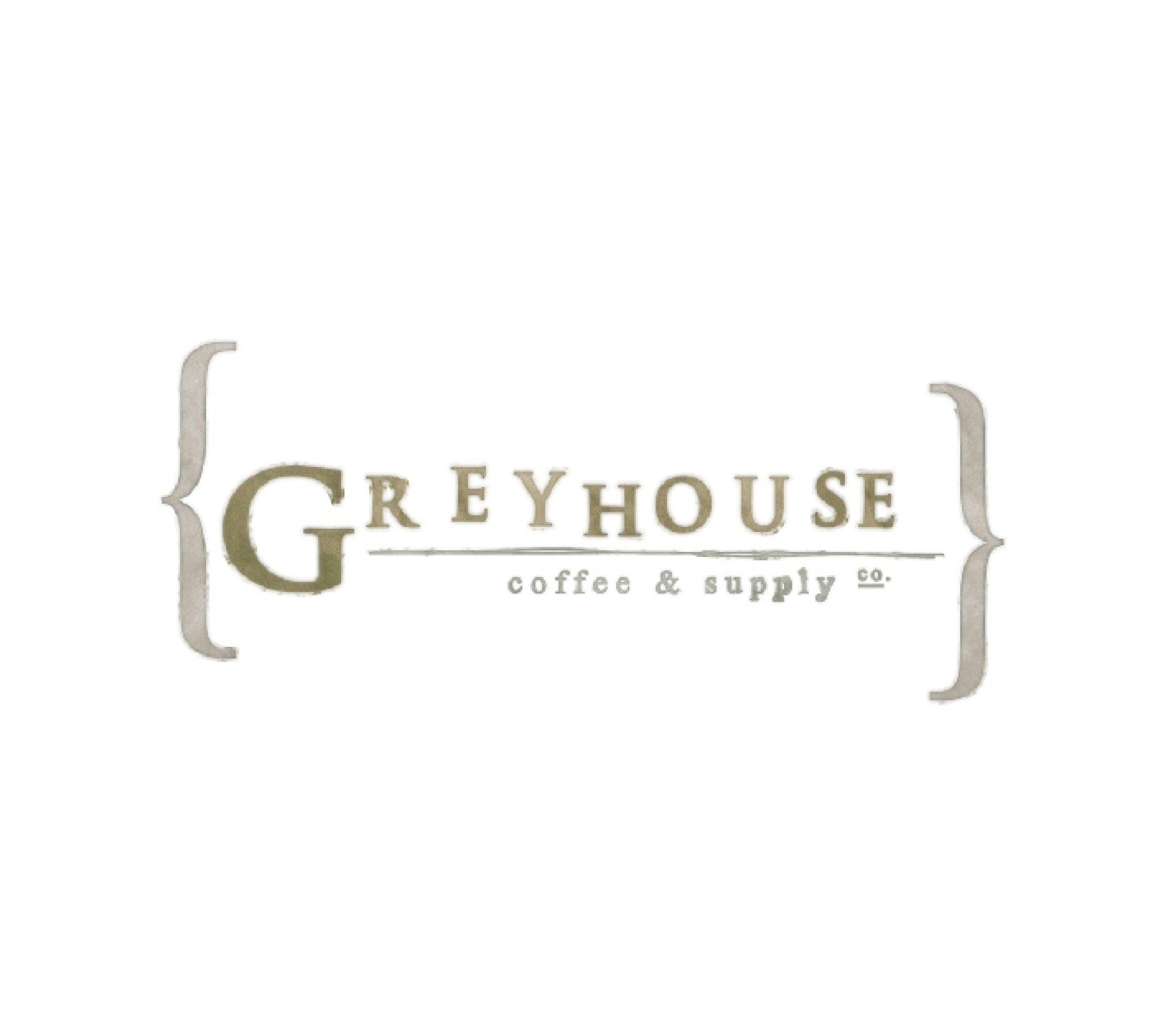
This one goes way back to 2008 when Raygun was nothing more than a side-hustle. I would be consider this my first sizable branding project. In collaboration with a very talented group of people, I had the privilege of developing an indelible brand that has continued to thrive and evolve. This particular logo iteration is the OG.
I came up with the name at the 11th hour and chose a typeface that was commonly used for motion picture titles. With a very 1920’s vibe, the hand-placed letters were intentionally offset with sketched outlines and a watercolor fill. It was extended to everything from hand-stamped to-go cups to signage letters routed out of old wooden doors.
#C6BEB3

#7A7450
#32311B